This is the monthly edition. It is free and it always will be.
Five government releases landed in the past few weeks. Read separately they produced five different headlines, some of them cheerful. Read together they mostly agree with each other, and the two places they disagree are the interesting part.
So this month is organised around that. What the data agrees on, what it contradicts itself about, and which side to believe when it does.
First, what came out
The Employment Cost Index for the second quarter, on 31 July. It measures what it costs to employ the same people doing the same work as a year ago.
The June JOLTS report, on 4 August. It counts job openings, hires, quits and layoffs.
The July jobs report, on Friday 7 August. Payrolls, by industry.
Consumer price inflation for June, in mid-July. Included here because compensation numbers mean nothing without it.
And the Census AI survey, which reports every two weeks and last covered the fortnight to 26 July.
It is worth one paragraph on which of those to trust, because they are not equally solid.
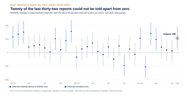
The jobs report is the most quoted and the most revised. The first estimate for any month gets updated twice, and once a year every month of the past five years is rebenchmarked against tax records. Recent benchmark revisions have taken jobs away rather than adding them. Treat any single month as a rough draft and the twelve month change as the real number.
The Employment Cost Index is the most reliable thing in this list and the least quoted. It holds the mix of jobs and industries fixed, which means it answers the question people think average hourly earnings answers. Average earnings can rise simply because low paid people were laid off. The ECI cannot.
JOLTS is a survey of about 21,000 employers and it is noisy month to month, so the direction over several months is worth more than any single reading.
The AI survey is large, about 1.2 million businesses, but it rotates its panels, so consecutive fortnights are answered by different companies. Small moves between readings are mostly sampling.
None of that is a reason to distrust the data. It is a reason to read it at the right resolution.
Where they agree: almost nothing is moving
This is the finding of the month and four separate releases point at it.
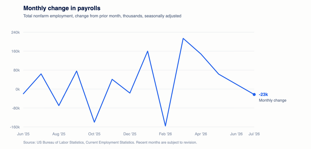
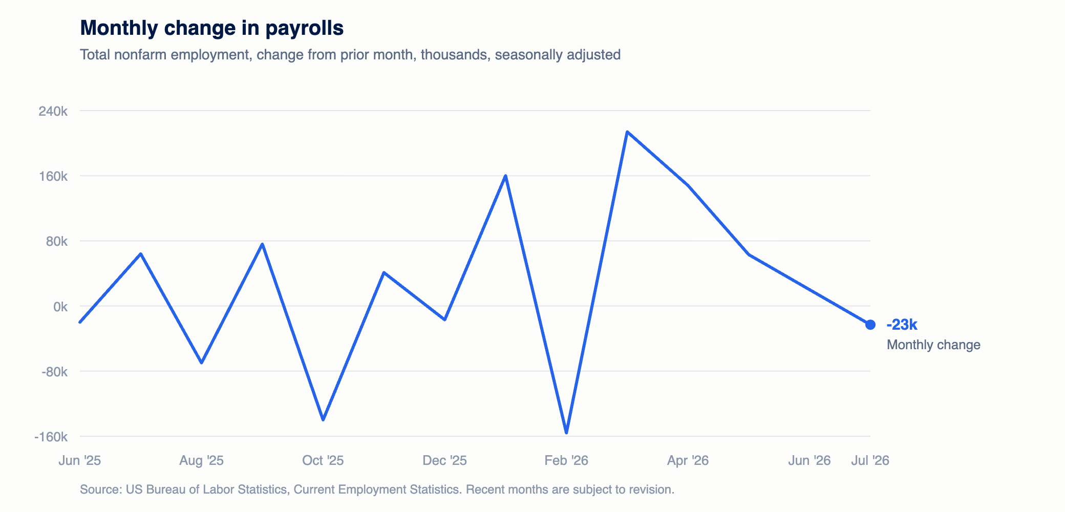
Payrolls fell 23,000 in July. That is the first monthly decline since February, and it is small enough to be noise, but the twelve month figure tells the same story more reliably: total employment grew 316,000 over the year, which is 0.2%.
People are not quitting. The quits rate was 2.0% in June. It has been between 1.9% and 2.2% every single month for 31 months. It averaged 2.32% through 2019, which nobody called a boom.
Employers are not hiring. The hires rate was 3.4% against 3.87% through 2019.
Employers are also not firing. The layoff rate was 1.1% against 1.21% through 2019, and it has not left a three tenths of a point band since January 2022.
And strikes have got smaller. In the twelve months to June there were 30 major work stoppages involving 184,700 workers. In the twelve months to June 2025 there were 38 stoppages involving 389,400. The number of stoppages fell about a fifth. The number of workers involved fell by more than half.
The national quits figure also hides a five to one spread, and it runs in a direction worth knowing.
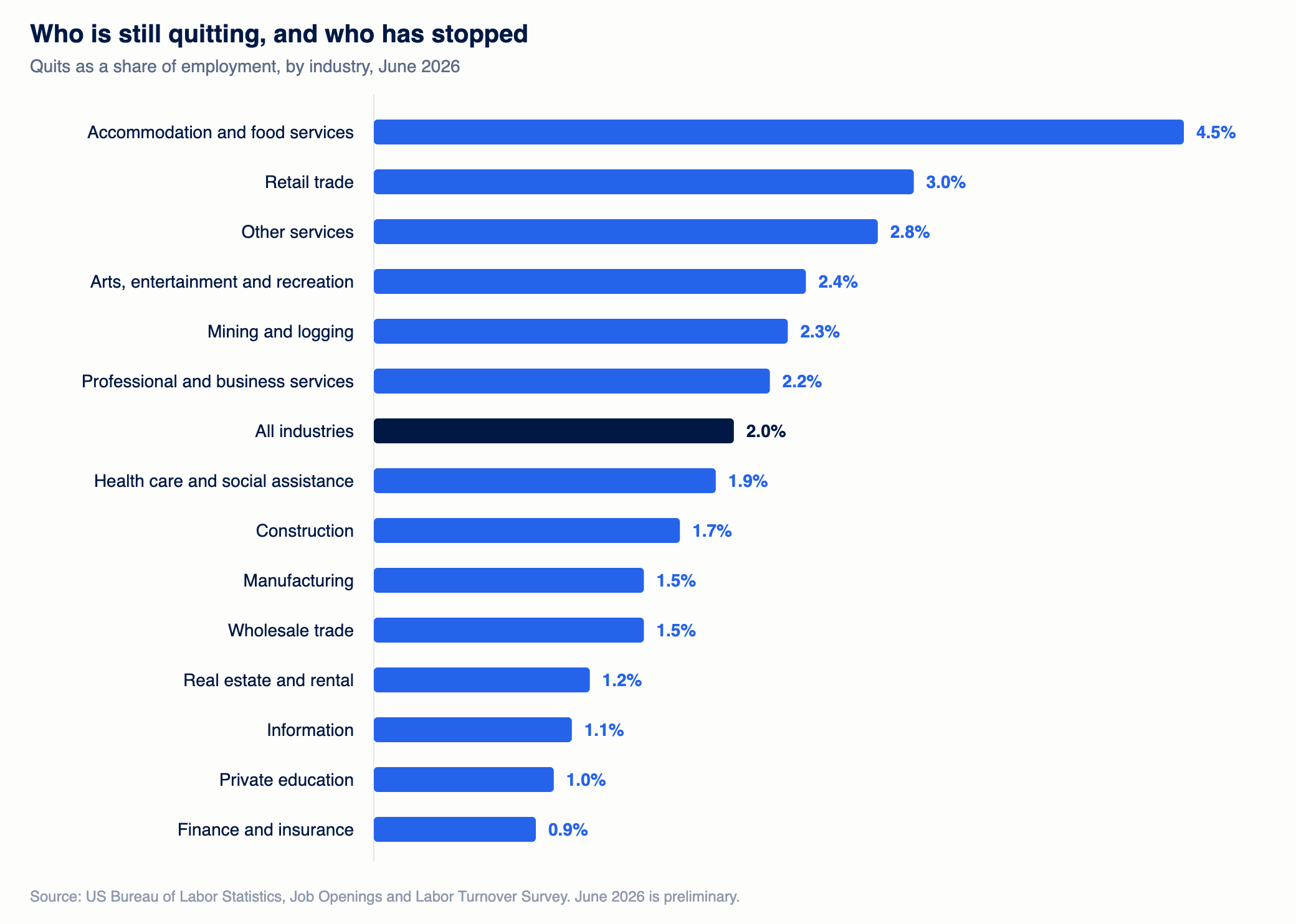
Accommodation and food services is at 4.5%. Retail is at 3.0%. Finance and insurance is at 0.9%, private education 1.0%, information 1.1%.
The industries holding the national average up are the lowest paid ones with the highest baseline turnover. In professional and office work almost nobody is voluntarily going anywhere. In a 1,000 person finance business, nine people leave of their own accord in a month. In hospitality the same headcount loses forty-five.
Four different measurements of movement, all low, all at once. Whatever else is true about this labor market, very few people are changing what they do.
Where they agree: the bill went up, the paycheck did not
The second thing the data agrees on is that employment is getting more expensive in a way that employees do not feel.
Over the year to June, private sector wages and salaries rose 3.1%. Benefits rose 3.8%. Total compensation rose 3.3%.
Consumer prices rose 3.53% over the same period.
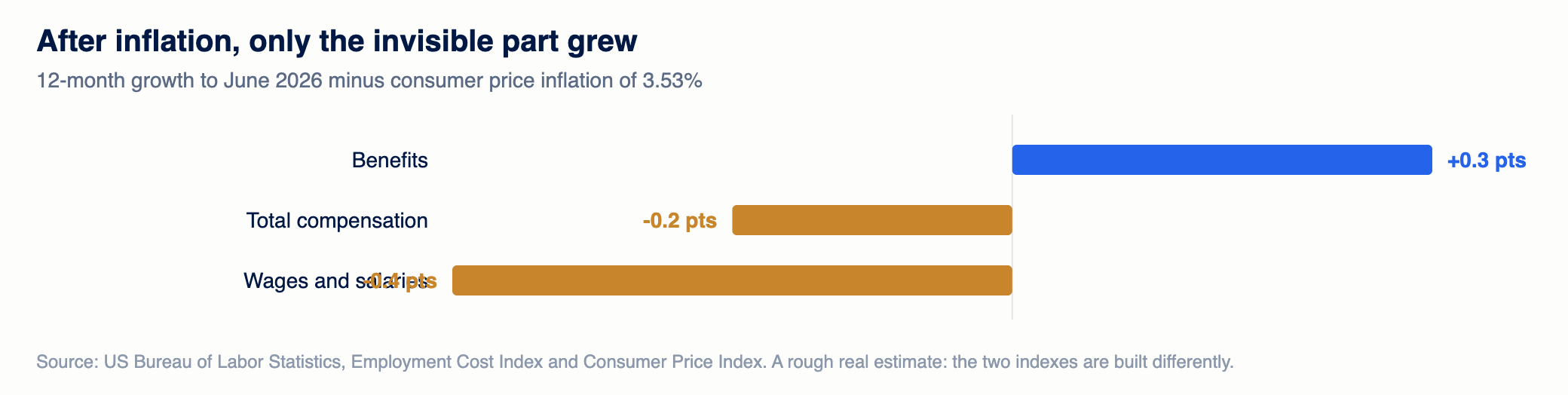
Adjust for that and pay fell about four tenths of a percent in real terms. Total compensation fell about two tenths. Benefits rose about three tenths.
The only part of the package that beat inflation is the part nobody sees on a pay stub.
The level data says where it went. The average private sector employee costs $46.60 an hour. Benefits are 30.1% of that, the highest share in the current run of the series. Insurance has gone from 7.2% of total compensation at the end of 2024 to 7.8% now, while retirement, paid leave and supplemental pay have not moved at all. Every bit of the increase is health insurance.
Where they contradict: openings say demand, payrolls say none
Now the disagreements, and there are two.
Job openings in June were 7.36 million, up from 7.20 million a year earlier. On its own that reads as employers wanting more people than they did last year.
Payroll growth over roughly the same period was 0.2%, and outside health care the private sector added 78,900 jobs on a base of 111.7 million. That reads as employers wanting almost nobody.
Both numbers are real. They cannot both be describing the same behaviour.
The way to settle it is the ratio between openings and actual hires. In June there were 1.38 openings for every hire made. In 2019 the figure was 1.23. Through the 2000s it ran below 1.0, meaning employers made more hires each month than they carried open posts.
So openings have become a worse and worse predictor of hiring. Either a meaningful share of posted jobs are not real, or they are real and employers have become much slower at converting them. Either way, the vacancy count is measuring intention and the payroll count is measuring what happened, and when those two disagree the one that already happened is the one to believe.
Where they contradict: low layoffs against falling real pay
The second disagreement is more subtle and it matters more.
A layoff rate below its 2019 average is normally a sign of a strong labor market. Falling real wages are normally a sign of a weak one. Both are true right now.
These look contradictory because we are used to job security and pay growth moving together. They do, but only through a mechanism, and the mechanism is people changing jobs.
Wage growth comes disproportionately from movement. Somebody leaves for more money, their old employer either matches or backfills at the market rate, and pay rises across the board without anyone deciding it should. That process runs on quitting, and quitting is running 15% below its pre-pandemic normal.
So the two facts are not in conflict. They are two outputs of the same stalled process. Nobody is being pushed out, and nobody is being bid away, and the second of those is what sets pay.
The one that is not moving with the others
AI adoption is the exception to the general stillness, and it is worth handling carefully because it is the number most likely to be misused.
In the fortnight to 26 July, 21.5% of US businesses said they had used AI in some part of the business. That is up from 17.3% at the end of November. The rise has been close to perfectly linear for eight months, at roughly 3.3 percentage points every six months, with no acceleration in any of them.
The spread underneath it is wide: 41.9% of businesses in information, 10.7% in transportation and warehousing.
Here is the part that gets asserted rather than checked. The sectors adopting AI fastest are also the sectors losing the most jobs. Information employment is down 81,000 over the year, 2.8% of the sector, and it has the highest adoption rate in the country. Financial activities is down 114,000 and finance is the third highest adopter.
That correlation is real and it proves nothing on its own. Information and finance are also the sectors that over-hired hardest in 2021 and 2022, and both have been correcting since well before this technology was widely deployed. A sector can shrink and adopt at the same time without one causing the other.
What can be said honestly is narrower and more useful. Adoption is spreading at a steady, unremarkable pace. It is concentrated in work that is already words and numbers on a screen. And the sectors where it is concentrated are shrinking for reasons that were visible before the technology arrived. Anyone claiming to know the causal split between those things is ahead of the evidence.
What actually happened to jobs
Back to payrolls, because the composition matters more than the total.
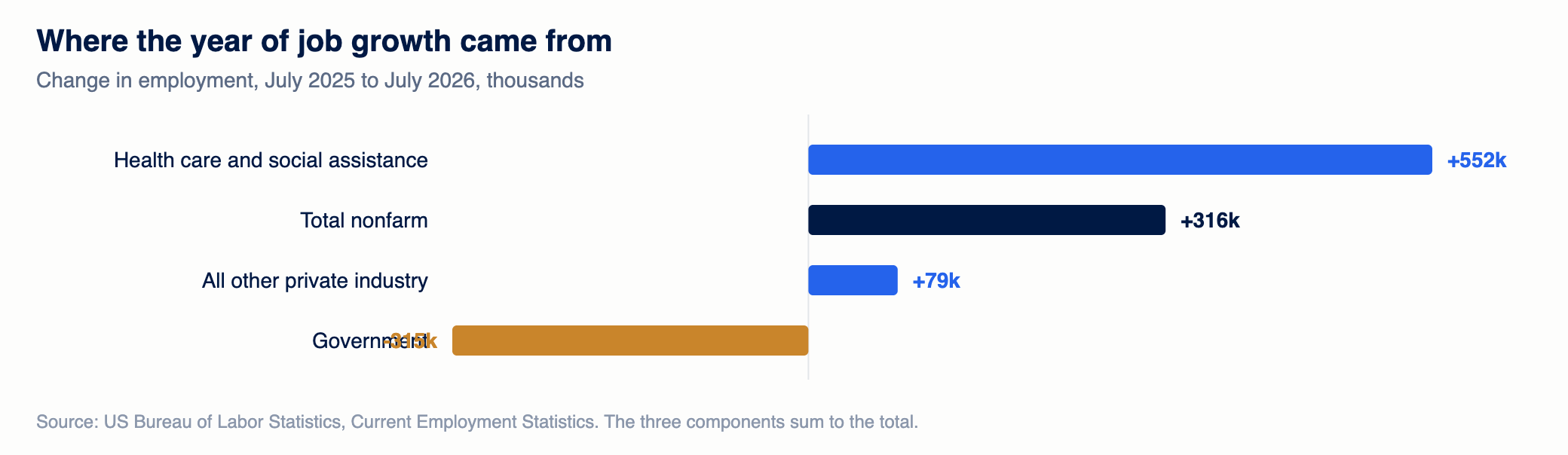
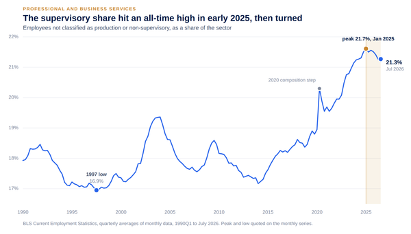
Health care and social assistance added 552,100 jobs over the year. All other private industry added 78,900. Government lost 315,000, of which 252,000 was federal.
Those three sum to the 316,000 headline.
That is one sector delivering more than the entire net gain, a private economy outside it growing at roughly nothing, and a deliberate federal reduction pulling the other way. Three unrelated processes whose signs happen to offset into a plausible looking national figure.
It is also historically unusual. Health care has added more over twelve months than the whole economy on only five previous occasions since 1991, and none of them lasted longer than three months. The current run is fourteen.
How to read a month like this
Three rules, and they generalise beyond this month.
Believe flows over stocks. A job opening is a stock, and it can sit there for a year meaning nothing. A hire or a quit is a flow, and it only exists because something happened. When the two disagree, as they do right now, the flow is the fact.
Check the level as well as the rate. A 3.3% compensation increase and a $46.60 hourly cost are the same information, but only the second one tells you that 30.1% of it is benefits and that health insurance is the entire increase.
Find your own sector before reacting to the national number. This month the national payroll figure is the sum of health care, everything else, and a federal reduction, and it describes none of them. The same is true of the quits rate: 2.0% nationally is 4.5% in accommodation and food and 0.9% in finance.
What this means if you are running something
If you are hiring, the market is less competitive than the openings number implies. Fewer good people are in motion, which makes sourcing slower, but your competitors are not pulling your people away either.
If you are looking at your own retention numbers and feeling pleased, check them against the national quits rate first. A 2.0% national rate against 2.32% in 2019 is doing work that no retention programme did.
If you are setting a compensation budget, the gap between what you spend and what your people feel is currently about seven tenths of a percentage point a year and widening, and all of it is health insurance. That is not a raise you can claim credit for.
And if you are being told a function is about to be automated away, ask which sector and which size of business the claim comes from. The answer usually turns out to be a 41.9% figure drawn from information businesses, and it does not transfer.
What to watch next month
Four things would change the picture described above, and all four are checkable on a known date.
The quits rate leaving its band. Three months above 2.2% would mean confidence returning, and would be the first sign that pay growth is about to pick up. Three months below 1.9% would mean the freeze is turning into something worse. Either one matters more than the payroll number. The July JOLTS report is due in early September.
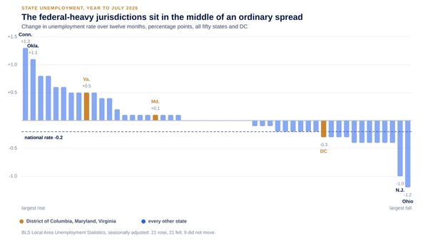
State unemployment for July, due around 21 August, will say whether the federal reduction is concentrating in particular states. A quarter of a million federal jobs is not spread evenly, and the national rate hides where it lands.
The August jobs report, due on the first Friday of September, and specifically whether health care is still supplying more than the entire net gain. That has now run fourteen months against a previous record of three. The month it stops is a genuine turning point in either direction.
And the next two AI readings. The straight line has held for eight months. Three consecutive readings clearly above it would be the first evidence of an actual inflection rather than a steady spread.
If none of those move, next month will look like this one, and that is the most likely outcome.
Where these numbers come from
Everything above is public data. The Bureau of Labor Statistics for employment, pay, turnover and work stoppages. The Census Bureau for AI adoption.
The payroll figures are from the establishment survey, are seasonally adjusted, and are revised, including an annual benchmark revision each February that has recently been unkind to first estimates. JOLTS is a survey of about 21,000 establishments and June is preliminary. The AI survey samples about 1.2 million businesses in six rotating panels, so consecutive readings are answered by different businesses and some of the fortnight to fortnight movement is sampling.
Where the data is thin or a definition changed, we say so rather than smoothing over it. The AI question wording changed in late 2025 and readings before that are not comparable to readings after it.
Every series is rebuilt each morning and published in the Data Room with its source named, so any number here can be checked against the release it came from.
The monthly edition is free. The weekly editions take one of these questions and work it through properly.